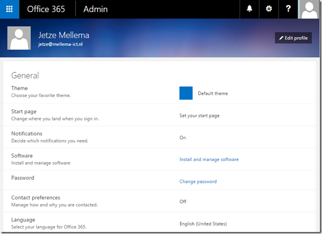
Microsoft has done a lot of work in their Office 365 Portal over the past few years, anyone who remembers the BPOS experience will agree. The experience we see today is very consistent and you need to keep an eye on the address bar of your browser to notice that you actually switched to a different website. It’s all modern, clean and very white-blue.
An area for improvement is the end-user self-service portal, the section that can be accessed by clicking on the gear icon in the top right corner of the screen. Recently Microsoft started updating this section too. First thing the user will notice is the gradient bar on top of the page and the centered items, in the previous version of the portal the items were aligned to the left of the page.
When a user clicks on a section head the area expands and allows the user to make changes without leaving the page. For instance when the user clicks on Language, the option to select the language appears:
There are two exemptions to this principle, that's the Password and Software sections. I expect those sections to be revised too somewhere in the near future. Many admins are waiting for the option to remove the Password section from this portal, let's hope we see this added soon.


No comments:
Post a Comment